A secret club that still has to say "join".
The brief
The founder was launching a private club with closed events at secret locations. The club had to feel exclusive, but not cold. People needed to want in, not feel shut out.
Approach
We started with a deep research phase: the market, direct competitors, and how private communities and event clubs present themselves. Most of them hide behind black screens and gold logos. They look exclusive, but they don't look like anywhere you'd want to be.
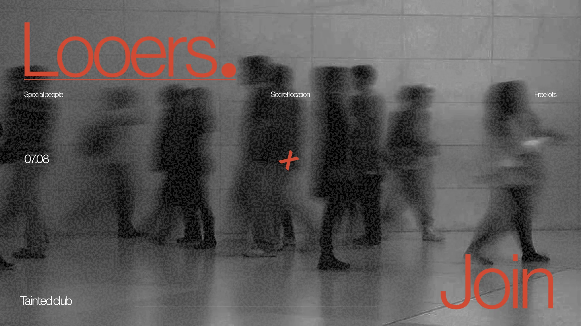
So we built the brand on two opposites. Grey, blurred crowds for the mystery. One warm orange for the people, the energy and the positive feeling of finally being let in.
What we built:
- 01 / 05
A colour with meaning.
Orange is the only bright thing in the system. It marks the name, the date and the invitation, and it reads as warmth, not warning.
- 02 / 05
People, but out of focus.
Blurred figures moving through a grey hall. You see that there's a crowd, not who's in it. Exactly how a secret club should feel.
- 03 / 05
Type that whispers, then speaks up.
Thin, tight lettering for the details, a huge "Looers." with a full stop, and a huge "Join" at the bottom.
- 04 / 05
Three facts, nothing more.
Special people. Secret location. Free lots. Plus a date. Everything else is held back on purpose.
- 05 / 05
A cross as the mark.
A small orange X in the middle of the screen marks the spot, like a place on a map you aren't supposed to have.
Result:
The brand and landing page were completed and handed over, but the club never launched. It's still one of our favourite identities.
We are open to cooperation.
You can contact us using one of the methods below: