One eye. No colour. No hype.
The brief
Cryptonaire is a paid community and course for people who want to understand crypto, not just gamble on it. The founder wanted a site that felt serious and personal at the same time, entirely in black and white.
The category is full of neon, rockets and promises of quick money. That was exactly what Cryptonaire had to avoid.
Approach
We ran full research first: competitor courses, how they sell, which promises their audience no longer believes. The pattern was clear. The louder the site, the less people trust it.
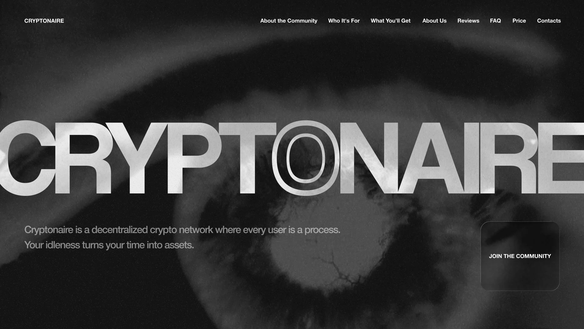
So we went quiet. No colour, no gimmicks, one image that carries the whole story. The eye of a person who matters to the founder sits behind the name. It watches, it pays attention, and it says this project is personal.
What we built:
- 01 / 05
The eye as the brand's centre.
- 02 / 05
A wordmark that fills the screen.
"Cryptonaire" runs edge to edge in heavy type, with the O drawn as an outline, like an iris inside the eye.
- 03 / 05
Copy with a thought, not a promise.
"Every user is a process. Your idleness turns your time into assets." It sells the idea, not quick profit.
- 04 / 05
Navigation that answers a buyer's questions in order.
About the community, who it's for, what you'll get, reviews, FAQ, price.
- 05 / 05
A custom set of brand elements.
Result:
The concept and homepage are approved. The site is in development.
We are open to cooperation.
You can contact us using one of the methods below: