(Go) beneath the surface.
The brief
Most NFT sites look the same: a grid of thumbnails and a mint button. We wanted to see what happens if the landing page is treated as an artwork, not a shop window.
The collection we imagined, Unveiled, is about identity: the faces we wear and what's under them. The page had to say that before anyone read a word.
Approach
We built the concept on one tension: self versus facade. Every element on the page either hides something or reveals it.
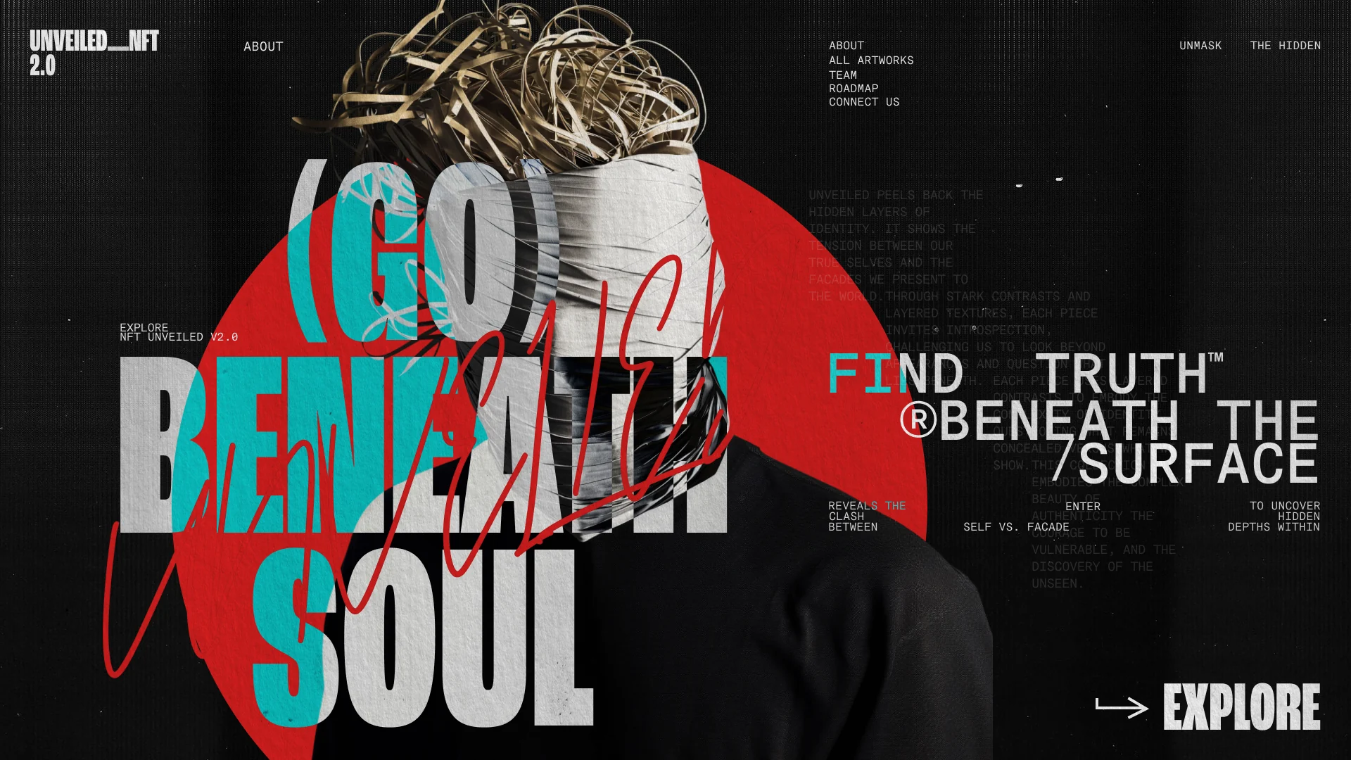
The visual language came from paper collage and street posters. Torn layers, a face wrapped in paper, a signature scrawled across the headline, a typewriter voice in the corner. Loud on purpose, but every block still has a job.
What we built:
- 01 / 05
A wrapped face as the hero.
The head is bound in paper, with the red sun behind it. The theme of the whole collection in one image.
- 02 / 05
Type that hides and shows.
"(Go) beneath soul" is layered in white and cyan, cut through by red handwriting, so you have to look twice to read it. That's the point.
- 03 / 05
A second voice in mono.
Small typewriter text runs beside the hero like a curator's note, explaining the collection for those who want to dig in.
- 04 / 05
One clear way forward.
Despite the chaos, the next step is obvious: a big "Explore" in the corner, and a short menu of About, All artworks, Team, Roadmap and Connect.
- 05 / 05
Four colours, no more.
Black, paper white, red and a single cyan. Wild composition, strict palette.
Result:
Concepts like this are how we test ideas without a client's limits. Unveiled showed us how far a layout can go and still guide people to one action.
We are open to cooperation.
You can contact us using one of the methods below: