2nd out of 89.
The brief
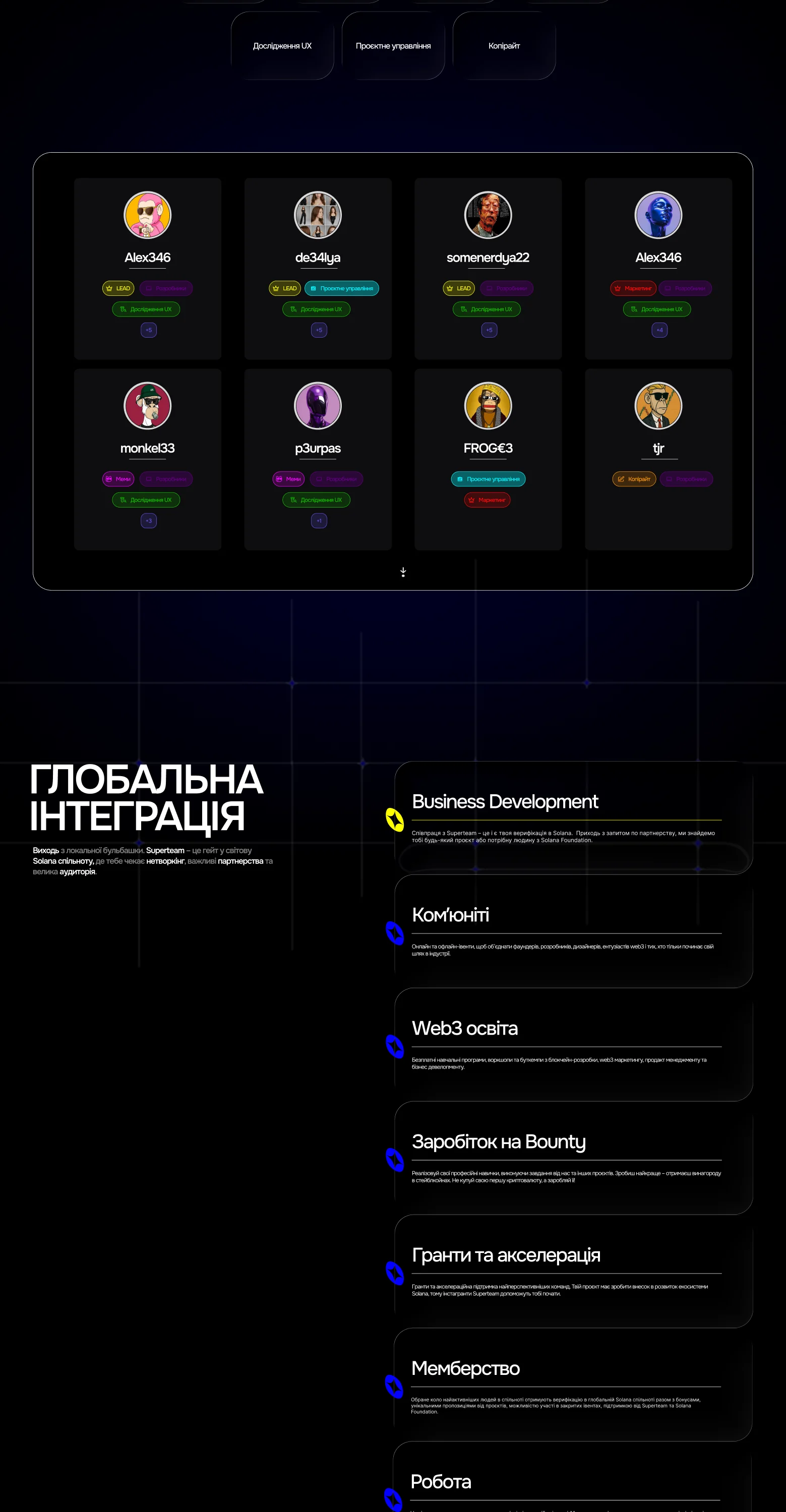
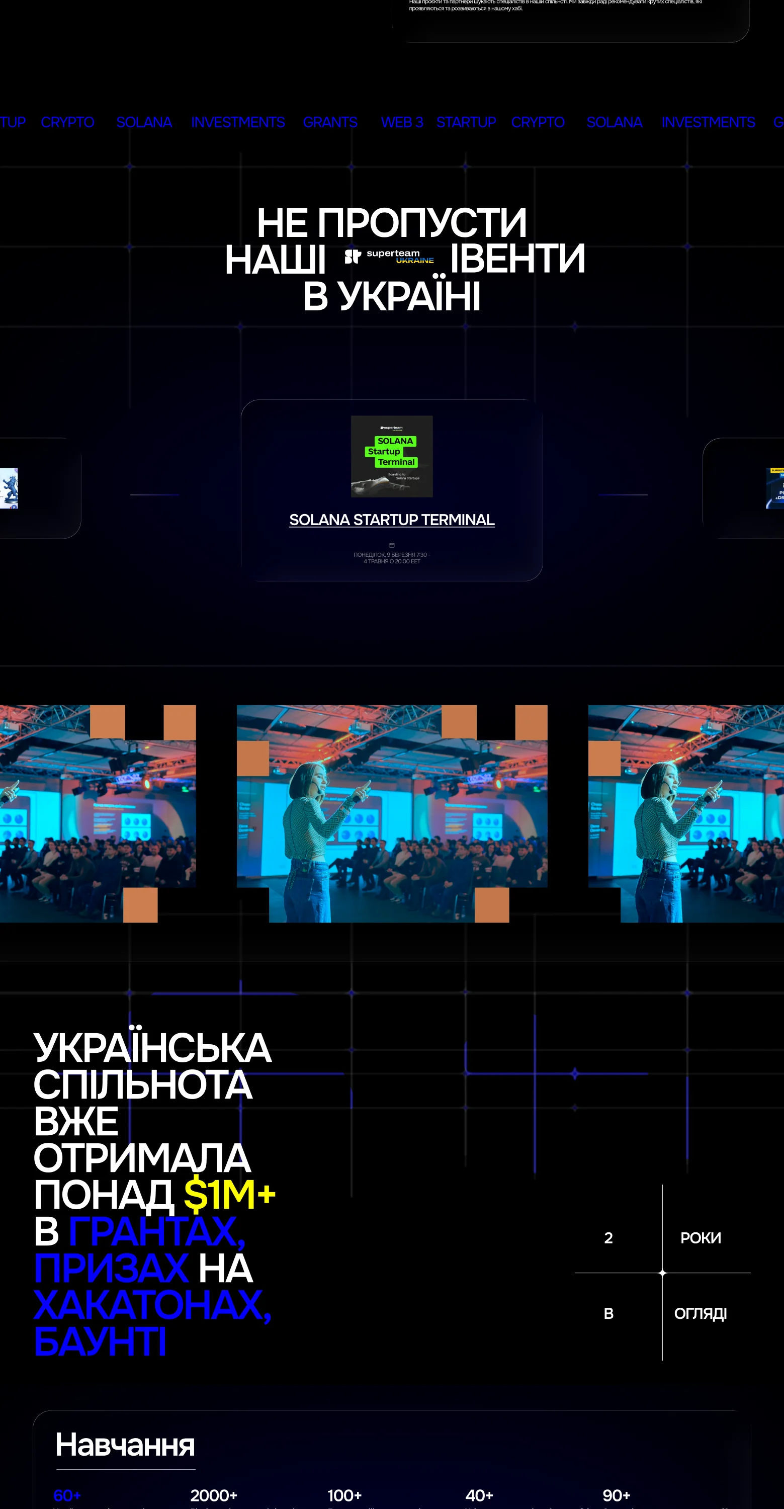
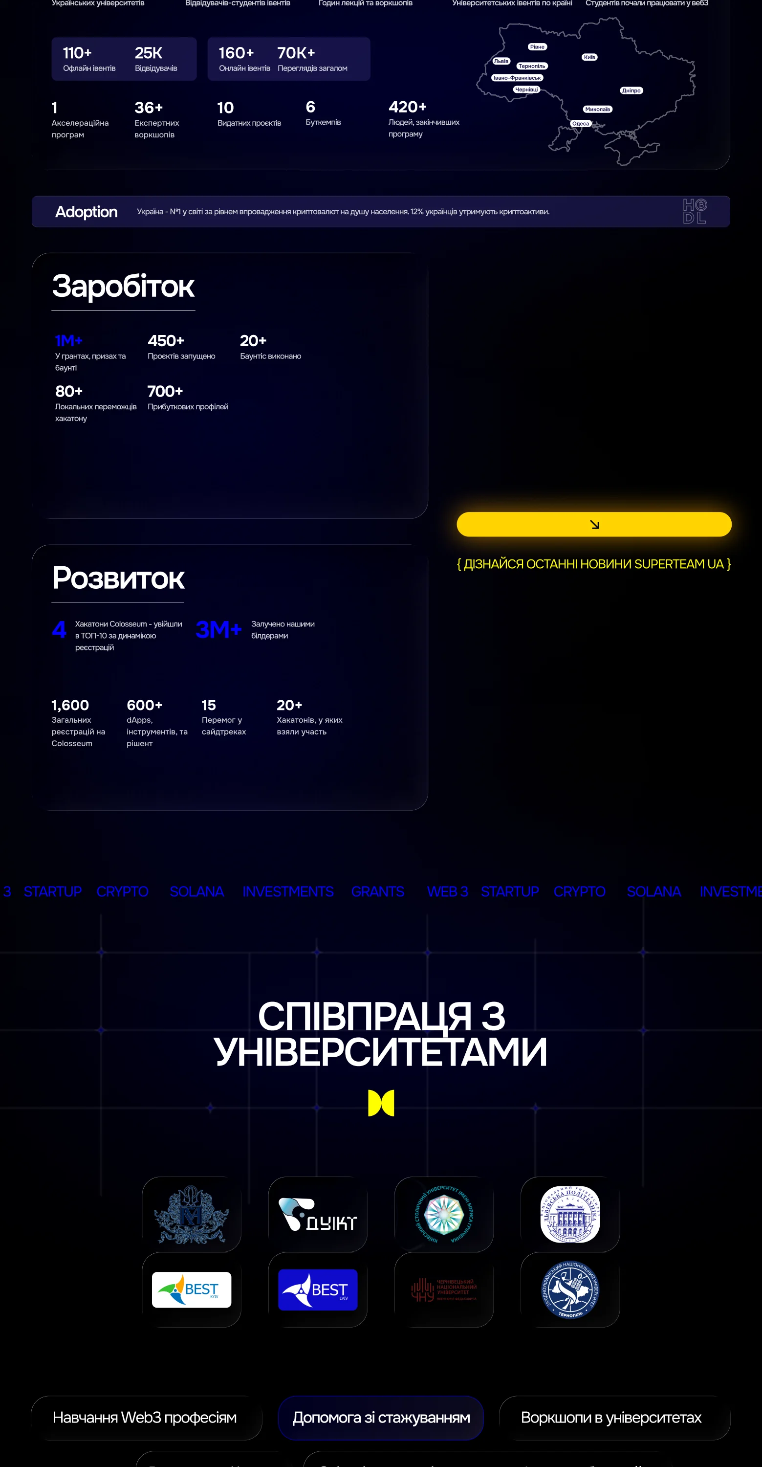
Superteam Ukraine is the country's largest Solana community: a place where Web3 startups launch, get grants and investment, and learn to earn in the crypto economy. They ran an open competition for their new landing page. 89 teams entered.
The brief asked for two things that usually pull in different directions: a strong national identity, and a page that clearly sells joining the community.
Approach
We started with research: how other Superteam chapters present themselves, and what makes a design read as Ukrainian without falling into clichés. Blue and yellow alone weren't enough. Every country uses its flag.
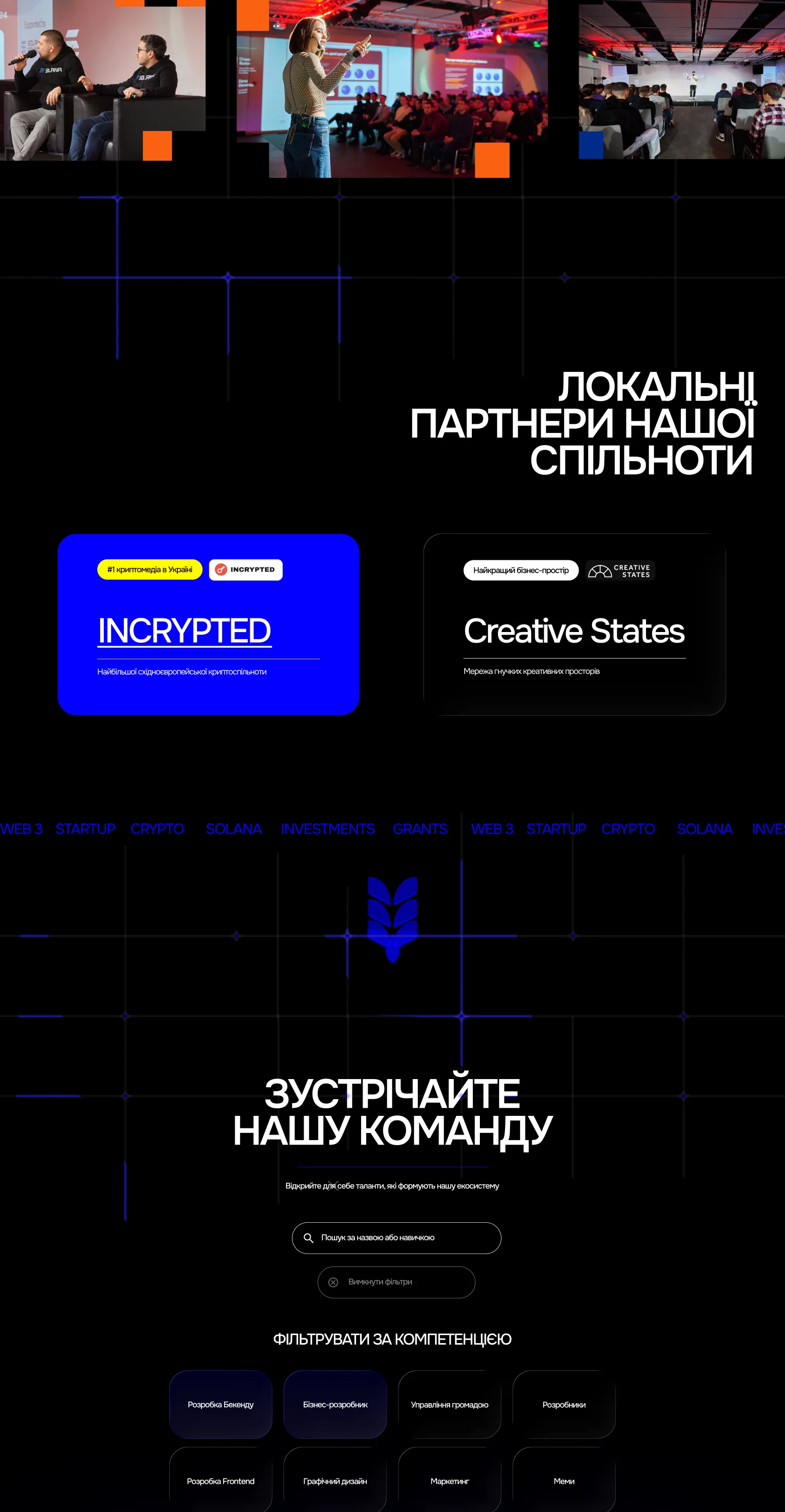
So we went to the symbols underneath. Wheat ears, ornament, the rhythm of folk patterns, redrawn as sharp geometric forms that sit naturally next to crypto graphics.
What we built:
- 01 / 05
Ukrainian symbols, drawn from scratch.
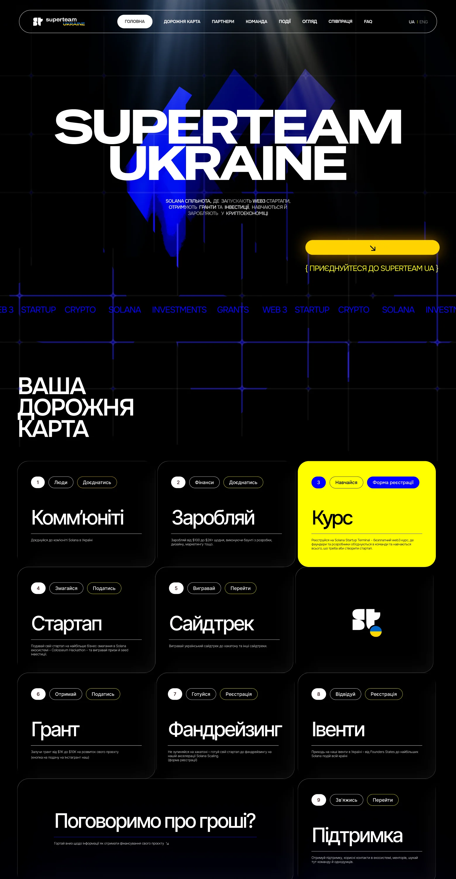
Abstract wheat ears rise behind the headline as blue light planes. You feel the reference before you name it.
- 02 / 05
Colour that moves.
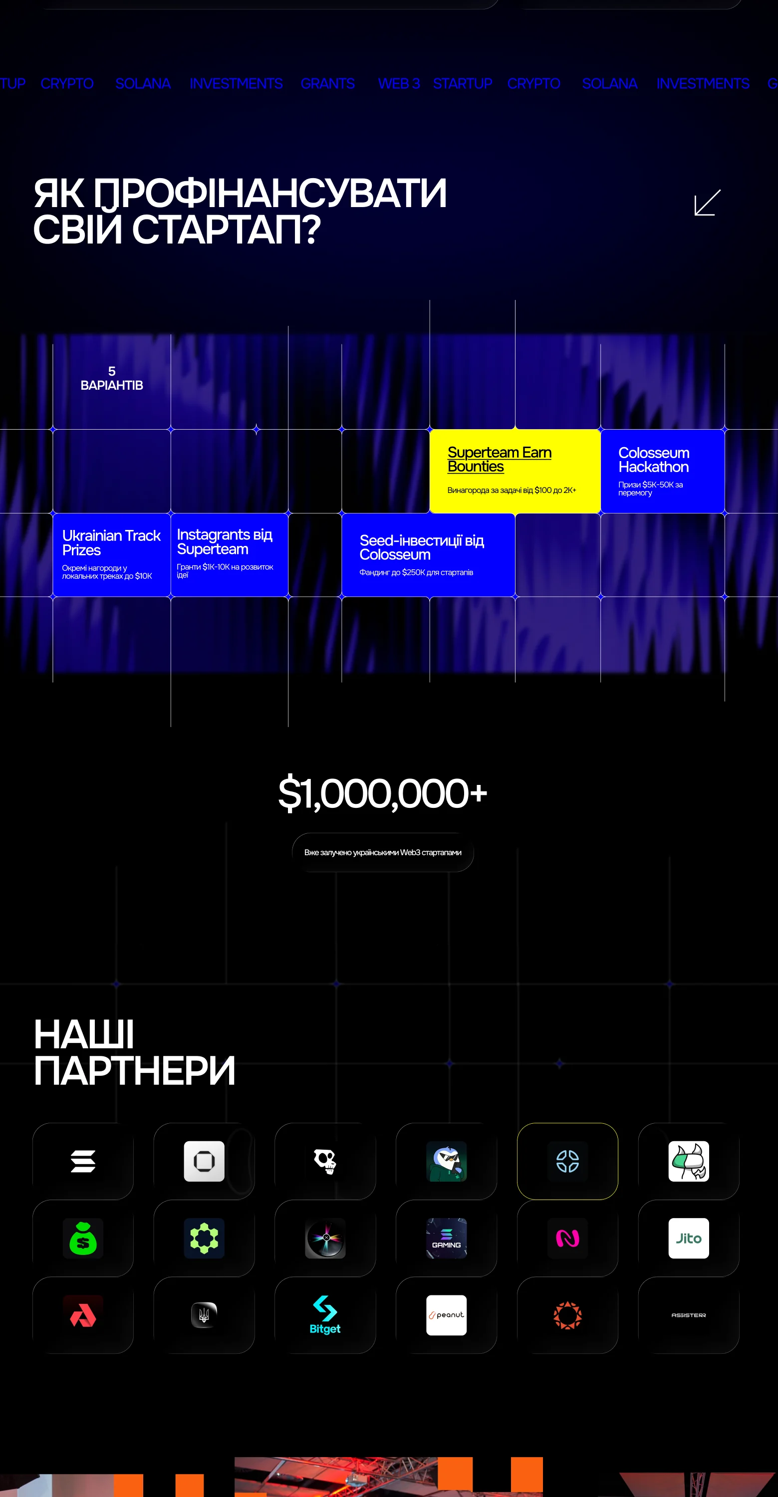
Blue flows into light and back, so the page feels like a live network, not a poster.
- 03 / 05
Bold type, clear words.
A loud headline, then a calm sentence that says exactly what the community gives you: launch, grants, investment, learning.
- 04 / 05
One clear action.
The yellow "Join Superteam UA" button is the brightest thing on the page. Nothing competes with it.
- 05 / 05
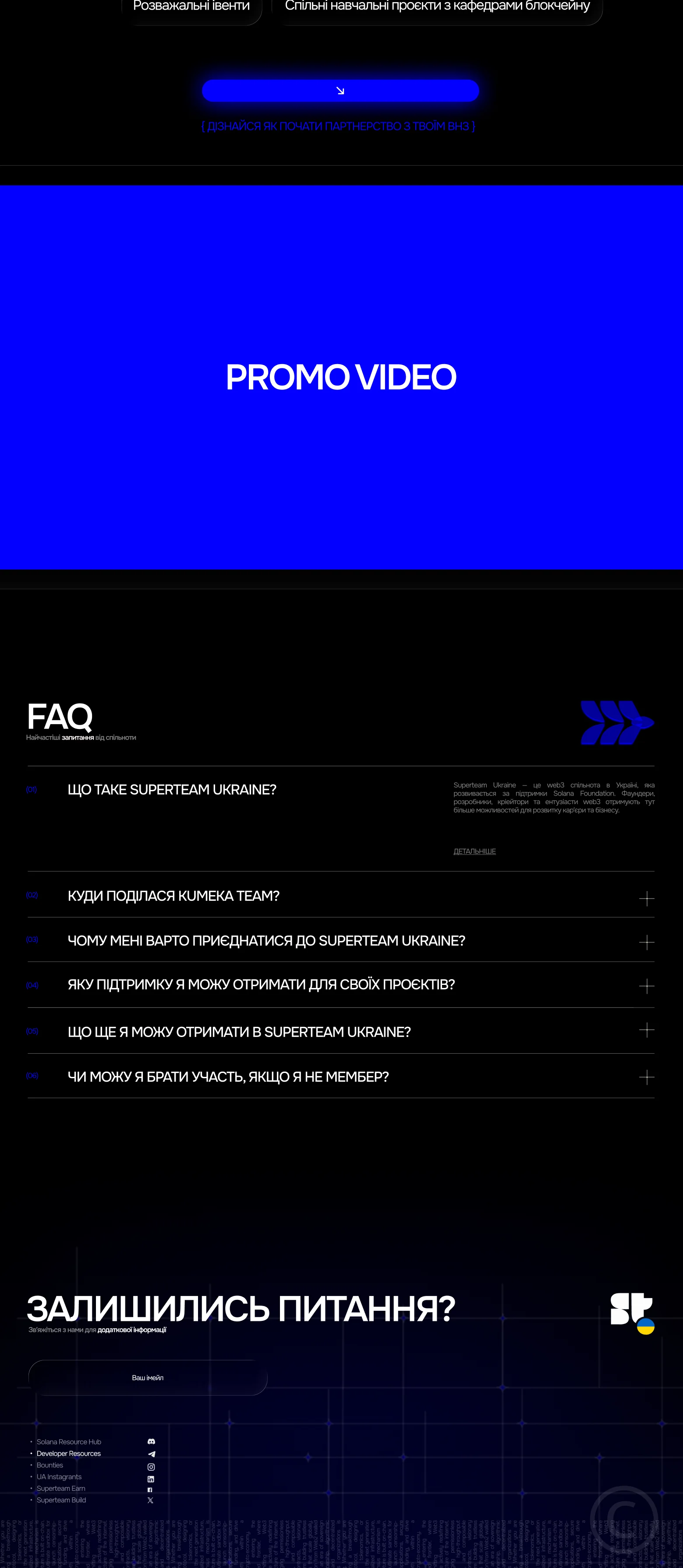
Built for two languages.
UA and ENG from the first sketch, so the layout holds in both.
Result:
2nd place out of 89 entries
The Superteam Ukraine team loved the concept, and the work turned into an ongoing relationship
The page is now in development
We are open to cooperation.
You can contact us using one of the methods below: